
Read as we examine elementary school, pooping contests, and oh yeah, there's some sports chatter in there as well
The NFL owners and the NFL Players’ Association have been butting heads over a myriad of issues in recent labor agreements in their turn of "Millionaires vs. Billionaires: NFL Edition". We've been through it with baseball, and hockey, who both ultimately cancelled a season's championship. The NBA also briefly flirted with the cancellation of a season, but ended up playing a shortened schedule in 1999. I don’t know enough about the whole thing to comment on the state of the negotiations or the bargaining discussions, but I do know that some of the items on the agenda are the prospect of playing 2 additional regular season games (which the players oppose for various health reasons), a rookie pay scale, and adjustment of the players’ retirement pension and healthcare. Those things, however, are not what I’m talking about.
The NFL owners and the NFL Players’ Association have been butting heads over a myriad of issues in recent labor agreements in their turn of "Millionaires vs. Billionaires: NFL Edition". We've been through it with baseball, and hockey, who both ultimately cancelled a season's championship. The NBA also briefly flirted with the cancellation of a season, but ended up playing a shortened schedule in 1999. I don’t know enough about the whole thing to comment on the state of the negotiations or the bargaining discussions, but I do know that some of the items on the agenda are the prospect of playing 2 additional regular season games (which the players oppose for various health reasons), a rookie pay scale, and adjustment of the players’ retirement pension and healthcare. Those things, however, are not what I’m talking about.
I couldn’t care less about the respective gripes of each party (except for the 18 game schedule, I don’t need to watch two more Bengals losses per season). What I do care about is how this story has been covered like it’s an asteroid about to hit the earth. Not even a cool asteroid either; it's more like a Deep Impact asteroid and less like an Armageddon asteroid. The gloom and doom coverage, the “what will I do without football?” crowd, and the “what am I going to talk about now” attitude of ESPN, are all groups of people who need to take a step back. I went through it in 2004-2005 when the NHL cancelled their season. Life goes on.
As for me, I won’t care either way, but if D-day does come and the season is cancelled, here are five reasons why I'll be just fine.
5. The Cincinnati Bengals
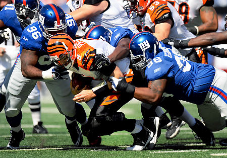
The Cincinnati Bengals suck and they’ve sucked for as long as I can remember. Even when they were good, they sucked. Even when they've accidentally made the playoffs, they got to the wild-card round and sucked. By now, I should know to not get emotionally involved, but they always bait me. Being a Bengals fan is the opposite of fun. I can’t remember it ever being fun and there’s no reason to believe it’ll be fun this season. Sports are supposed to be fun, but being a Bengals fan is miserable, hopeless torture. I’d change allegiances, but I’d feel a tremendous amount of guilt. Plus, I have thousands of dollars sunk into worthless Bengals merchandise and apparel not easily replaced by worthless merchandise and apparel of some other team.
Right now, the Bengals’ future is bleak. The not-even-that-good franchise quarterback has declared that he’d rather forgo millions of dollars than ever set foot in Paul Brown Stadium again. The team is coming off a 4-12 season that included a 10 game losing streak, and head coach Marvin Lewis was rewarded with a new contract. Lastly, Mike Brown, the Owner/President/General Manager/Paul Brown’s son/world's largest infant, is staunchly opposed to making any sort of move that would positively benefit the franchise and is still the man in charge. The future is non-existent and it doesn’t look like it’s going to get better anytime soon.
 |
| Sincerely, he looks like a giant infant. |
What does this all this mean? It means that a cancelled season would spell relief from having to suffer through 16 (or worse, 18) Cincinnati Bengals games in 2011. Also, it would guarantee that the Pittsburgh Steelers wouldn’t win the Super Bowl for at least another year. Though, I wouldn’t put it past the NFL to award them the Lombardi trophy by virtue of simply being the Pittsburgh Steelers. It's been done before (Super Bowl XL).
4. College Football
Football is one of the few sports where the feeder system is as good, and many would argue better, than the professional level. I've always straddled the line between the two and always kept them separated. Saturdays have alway been for Ohio State, Sundays for the Bengals. Unlike so many, I never felt the need to pick one over the other.
That said, I've always found the NFL to be cold, sterile, and corporate. Collegiate football is (perceptively) innocent, more traditional, and evocative of things like green hedge bushes, brick stadiums on picturesque campuses, and autumn leaves. The romance of college football that exists because of things like Knute Rockne, Michigan's winged helmets, and the Heisman Trophy can't be found anywhere in the NFL. College football is less calculated, and feels more like an athletic competition than the neatly scripted three hour television show that is an NFL broadcast.
 |
| See? Hedges. |
For the hardened NFL fan, it'll sort of be like when a hot celebrity actress marries one of the Lakers, and he's then immediately traded to Milwaukee or Oklahoma City (I resisted the urge to put Cleveland there). You're still married to an athlete, but it's just not the same. College football won't replace the NFL for the diehards, but it will make it easier than say, when hockey cancelled their season and I had to watch the AHL instead. Even with OSU about to face the wrath of the NCAA in response to "tattoo-gate", college ball will deliver more than enough thrilling football action to get me by for the season, and who knows, maybe my alma-mater (OU Bobcats) will get to play on a couple of Sunday nights.
3. Other Sports
Here's something weird, I'm not that big a fan of football. I should be, right? I'm from America, and more specifically, central Ohio. I'm supposed to worship the game and the gods who play it. I like football, I like Ohio State football, and for some reason, I love the Cincinnati Bengals, but I love baseball and I really love ice hockey. I just don't find myself as enamored with football as everyone else seems to be. It's treated as if it's the "ultimate" sport, but to me that's ice hockey. If I could pick one team to win one trophy, it'd be the Blue Jackets and it'd be the Stanley Cup. I love that something so cool even exists. I like hockey so much, I don't understand how people don't like it.
 |
| The goal that clinched the 7th seed in the playoffs that they were ultimately swept from. Sadly, my favorite Blue Jackets memory. |
When compared to football as a sport, I prefer the idiosyncratic and "human board game" nature of baseball, and the physicality combined with the incredible athleticism and creativity involved with hockey. Football has too many rules and too many players, too many injuries, and too many games end in outcomes outside of the control of the best players.
Here's the other thing, baseball starts in early April and my guys are actually poised to make another playoff run. The Reds will likely be involved in a pennant race in August and September. That takes me to October when the Columbus Blue Jackets season starts and by the time their season is over, baseball's back. I could get by if the NFL never came back.
 |
| I need more of this, however. |
2. The NFL could stand to come down a few pegs
When I was in the fourth grade there was this girl, who shall remain nameless, who thought very highly of herself. She was like a lot of fourth grade girls. She was snotty, judgmental, and needlessly mean. She was as close to being a bitch as a ten year old girl can be, and as we grew up she became the real deal. For this story, we'll refer to her as "future bitch" or "FB" for short. One day at recess my friend, Chris, kicked a soccer ball that accidentally drilled Future Bitch right between the eyes. The force of the ball hitting FB in the face caused her to fly backwards where she landed in mud that ruined whatever outfit she had spent that morning obsessing over. It was embarrassing for her, funny for the rest of us. The thing was, it was a big bowl of well-deserved karma. Had it been anyone else, the rest of the class would've felt sympathetic. Instead, everyone just thought it was hilarious and for about a week, we didn't have to deal with her crap.
 |
| She grew up to be this girl. She did always love the mud. |
The NFL is Future Bitch. They're the big dog and the bully. No league treats their season ticket holders as poorly or is as demanding. Ticket prices are exorbitant and many season ticket holders are expected to shell out thousands just for the license to their seat before they ever purchase the tickets. If a season is cancelled the NFL will feel what baseball felt in 1995 and what the NHL has felt since 2005. Fans don't like when you jerk them around, and the idea that billionaires want more money will keep many members of the NFL's hardworking fanbase from ever coming back. It would be a sizable enough group that the league would notice the pinch. If their hubris is large enough to think that they won't be affected, then the league office is more arrogant than previously believed. The NFL could stand to come back down from its perch to relearn what it's like to treat your customers properly, and when that happens, we all win.
1. ESPN could stand to come down a few pegs
Here's another anecdote to round-a-boutly set up a point: my senior year of high school our baseball team traveled to Orlando for a week of spring training. We got off the plane, got to our hotel, and then I left a massive steamer in my room's toilet. It was, for sure, a lifetime top fiver. It wasn't at a Bono level of Courics, but it was at least on "The Edge" level. I had to show my roommate, I had no choice. He then subsequently showed everyone else on the baseball team. One guy, one of the most competitive people I've ever met, said, "I can poop bigger than that". Without warning, I found myself entered into a pooping contest. We then got on a bus and went to freaking Disneyworld of all places. He didn't use the bathroom all day, ate three chili-cheese dogs and one of those giant turkey legs. Mind you, this is all while strolling around MGM Studios and riding the Tower of Terror and Rockin' Rollercoaster. I'll be honest, his dump was pretty big, bigger than the average everyday poop, but it wasn't even close to mine, and it split in half. I think he went wrong by not choosing more fiber loaded options.
 |
| It wasn't as big as this, but... |
So how could that possibly have anything to do with ESPN? Are you ready? Their entire NFL coverage is one big pooping contest. Watching their lead-up show on Sunday mornings is a game of watching which one of the "experts" can take the biggest dump, metaphorically speaking of course.
I know very little about the X's and O's of football, but I turn on their show and I hear Mike Ditka say things like, "the Texans are 2-2, they don't want to lose this game to go to 2-3". Really, Mike? Dynamite drop-in.
Chris Berman's shtick has been tired since at least 1985 and as far as I'm concerned, Cris Carter and Keyshawn Johnson are the exact same person. They're both possession receivers from the same era who played at major college programs. How different could their perspective possibly be? I really don't need to hear what a wide receiver thinks, and I definitely don't need it twice on a five person panel.
The only tolerable analyst in the group is Tom Jackson, but in recent years he's fallen into the habit of inserting passionate opinions that should have no place in what is supposed to be an unbiased center of journalism.
Without the NFL to cover, ESPN will have to relearn how to cover other sports. Perhaps that means that Sportscenter goes back to showing every highlight from every game from every sport from the night before?
Above all that though, the most comforting thing about not having the NFL next year is the idea that we'll see less of John Clayton
 |
| ahhhhhhhhhhhhhhhhhhhh!!!!!!!!!!!!!!! |
But don't worry, diehards, the season is still months away, and they still have plenty of time to agree on something. I have very little worry that the season will be cancelled, but if it is, you'll survive.


