
This is that logo
 |
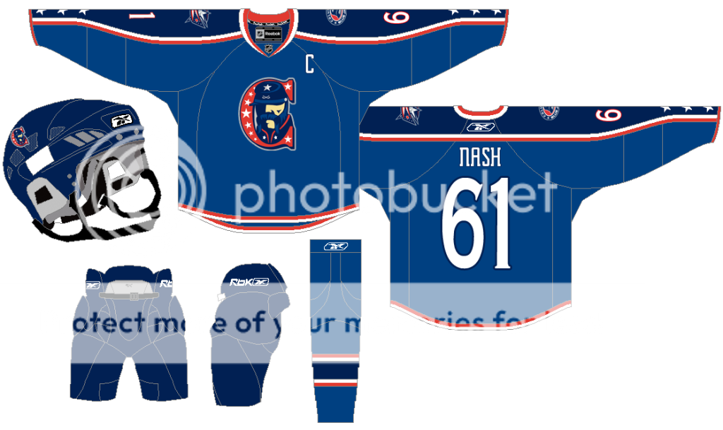
The 'C' stands for "Columbus" For the record, his name is "Sgt. Atticus McArthur". If I were a Civil War buff, he'd be named after someone real, probably someone who actually had some historical influence and relevance to Columbus or Ohio, at the very least. Instead, he's named after a guy I made up. |
Now that I look at it, I'm not going to pretend that I think this could've adorned the Blue Jackets' sweaters. I couldn't even figure out a good way to illustrate his eyes so I just let the cap cover them. One thing I am proud of though is that the left side of his face, minus the nose, is intentionally supposed to vaguely resemble the state of Ohio. It's one of those little subtle nuances that artists put into their work. This one is so subtle that it has to be pointed out to everyone.
I'm realistic about this now, but at the time, however, I had a horrible case of delusion. Delusions of grandeur, as they say. I imagined sharing the design with the internet, someone with the team catching wind of it and then showing it to CBJ brass. They'd say, "We love your design, and we'd like the team to wear it. Here's a 100 grand and the rights to all merchandise royalties. Also, we need a 5'10 left winger, how'd you like to suit up? We're playing Detroit tonight and we'd like you to whack Todd Bertuzzi in the face with your stick."
Incredibly, the scenario didn't play out that way and like geocities or myspace, my designs were lost to the internet. Instead this is what the team went with:

They hired a pro who ripped a soccer crest and stripped the uniform of red. But I spent a lot of time on my work and I'd like to share them. So here they are. (click to expand)
 |
| This was inspired by the Team USA jerseys and large block letters on the front of jerseys have been in vogue in the NHL recently. |

Which would you prefer? What they actually went with, or mine? I guess I'd choose what they actually went with, but I'm self-disparaging that way.
And because I recently met someone who didn't believe that I used to play hockey, here's a picture of me playing hockey.

Whenever I tell people from small backwoods/hilljack towns that I played hockey they act like I told them that I walked on the moon or that I used to live in the white house. They're even more surprised to learn that my high school had an actual varsity ice hockey team. One day, this time of year will be filled with Blue Jackets playoff articles, but for right now, this will have to do. Thanks for reading.
No comments:
Post a Comment